They say good design is invisible. The contrary is true as well…
Absence of good design is obvious.
About 2 months ago I published a blog post here titled “Rethinking Plain Member Area Dashboards” and it got a very good response. Lesley Sim from Newsletter Glue loved it and reached out with a rough wireframe on what she needs to get done.

Now usually I only take up design projects and work in Figma. But this project depended on how much customization was actually possible. Also since they only had 1 product, UI was straightforward based on her wireframe. She inquired whether I can code this project as well and since it looked very simple, I said yes.
Having started my career as a front-end designer, and later having coded many WordPress themes at templatic in the initial days, I know my fair share of coding. And for the programming part, I collaborate with other Developers. This project seemed to require just a little Developer help as well.
The story is long but what seemed like a small little project, took a lot longer than expected to execute. One Developer quit the project after trying to figure out things for days and in the end, another Developer completed it.
Anyway, let’s delve deeper into the project.
Our Approach
We wanted to update the design of the EDD member area despite it being notoriously difficult to do so.
Very quickly we realised little to no customisation was possible. All EDD provided was a few shortcodes that simply dumped the data onto the page. If we want to move or reorganize any element, we are on our own.
This resulted in us having to study the core code of the plugin and write custom code for whatever we needed. So instead of design first, we took the programming first approach for this. Basically, we would program first to see what is even possible, and then design around those limitations. What looked like a 2-3 days project, took us a lot longer than that.
In the rest of this case study, you’ll see what we managed to accomplish and how.
Member Area Pages
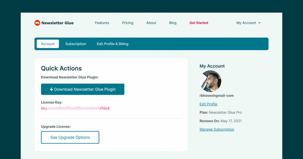
Since Newsletter Glue has one product, we wanted a very simple and user-friendly dashboard. However, the shortcode provided by EDD was useless for the kind of layout we wanted. So we wrote custom code and got the data in the way we wanted. There were several iterations but eventually, we finalized something very like this.

At the top, is a clear member area navigation followed by the “Quick Actions” section which helps the user do the #1 job he wants on this page. Download the product. Followed by the license key and some other details. We also take this opportunity to show the upgrade possibility for up-selling.
On the right, we show “My account” details with basic user information and necessary links to manage the profile.
Below that is a customizable HTML block where we are showing the “How to Install” video and links. But this could also be used for future upsell, notices, etc. All from within wp-admin, without having to touch any files. More on this, later in this article.

For the subscription page, again a custom coded page was created. Instead of table output, we coded this in Columns and rearranged the data that is much more user-friendly and serves our purpose.
We show complete subscription details. Along with highlighted “Upgrade” button upsell. Plus a list of invoices that users can generate and download PDFs of.
Manage Sites and Upgrade Options
There were a few things that we wanted to do but could not. The subscription page also shows “Manage Sites” and “Upgrade Options”. We wanted to make this resemble the same UI as the rest of the pages. But this data was only generated when we clicked these links. And it was not really possible to fetch it otherwise.
So we had to settle with very few improvements we could do. Such as styling the data on a screen instead of arranging it in an intuitive manner.
Blank States
We also wanted to make sure users have a good experience in their entire journey. The blank states are usually missed because they appear in rare cases. So we created multiple accounts and tested them thoroughly and designed them for all states – for no subscription, active subscription, cancelled subscription, extended subscriptions, etc. Even in cases where a person would buy the plugin multiple times, under different plans.
The pages would look good in all the cases.

We didn’t forget the receipt page. The first interaction the user would have after making the payment.

Easy to customize and manage blocks
With this project, one of our goals was to keep custom blocks at places where Lesley can easily add/edit/delete content in the future.
However, this is not easily accomplished in EDD as very little template help for the member area was available. So we created two separate blocks which were accessible in wp-admin > settings > ___. Here, Lesley was able to customize everything she wanted. Since she is a programmer herself, we kept HTML blocks there so she could play with them the way she wants and achieve any kind of section design she want.

Two blocks were custom coded for this so they can manage the content on this page the way they want.
Overall, a fun, simple project – with some hiccups along the way.
Delight Your Customers
It was good of her to have invested time, money, and efforts into making member area user experience better. Members perhaps don’t expect much from the member area. And this is a perfect opportunity to delight users – when they least expect it. Plus, it is guaranteed that they are going to visit this page. Why not make most of it?
Not only this page could be used to make things easier for members. But this is also an opportunity for you to upsell, announce, reward or inform the end-users.
And finally, here’s what Lesley Sim, the founder of Newsletter Glue has to say about working with me and this project…
Some Takeaways
- Delight your customers. And show the quality is equally good on the other side of the fence.
- Design member area depending on the kind of products you have, the kind of information users need to access right away, your business goal, upsell availability, etc.
- Member area is a good place to upsell, inform or warn users about something. Done right, this could also decrease some repetitive support queries. Take benefit of this area.
- If you are using EDD and want to customize the account pages, be prepared to delve deeper into the core code of the plugin. And this would require some really good programming knowledge. Even then, not everything would be possible the way you want.
- We skipped the design part and that had us pay the price during development as several things were coded which we ended up not using. Could have saved time if we took a design-first approach.
- Project estimations don’t always work. Unexpected roadblocks come up. All kinds of delays could happen. It’s nice to not have a strict deadline when delving into uncertain projects like this.
Overall, I loved doing this project. Learned so much and would love to do this again for EDD now that I know this territory.